
You might recall I was experimenting with polished pigment backgrounds earlier this year. Here's an image to refresh your memory. At the time I remember saying that they were really rather hideous but I promised I would eventually use these backgrounds and here's what I did with them.

 At the time I remember saying that they were really rather hideous but I promised I would eventually use these backgrounds and here's what I did with them.
Wow! ..... orchid and lime green!
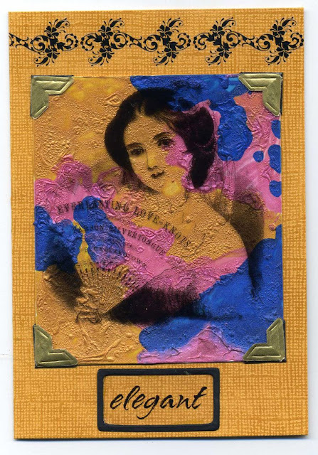
The image is from Rachel Greig's Darkroom Door collection and the word "tulip" is stamped with metal alphabet stamps on metal shim. I added a layer of black gloss card sprayed with gold webbing spray to make it more substantial and added a lime green layer for the card base.
The next piece had really great texture and I wanted to show it off instead of covering it up with an image..... the solution, a transparency! This one is from Stylish Images. I layered it on card stock which matched the gold polished pigments so that the gold blended off the background and onto the card. The flourish at the top is a rub on and it finishes off the card nicely. The third piece I made up into an ATC. I cut the heart from angel wire with my Cuttlebug and added some rub on flourishes to it. The letter Q is painted with polished pigments and frames an image and then I added a couple of ribbons and paper flowers. The touch of cream balances out the rust and blue really nicely.
 So there you have it. Even ugly backgrounds aren't necessarily ugly - it's all just a matter of finding the right images and embellishments to work with it.
 The third piece I made up into an ATC. I cut the heart from angel wire with my Cuttlebug and added some rub on flourishes to it. The letter Q is painted with polished pigments and frames an image and then I added a couple of ribbons and paper flowers. The touch of cream balances out the rust and blue really nicely.
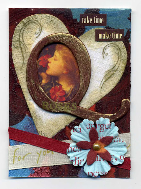 So there you have it. Even ugly backgrounds aren't necessarily ugly - it's all just a matter of finding the right images and embellishments to work with it.
